BRAND
GUIDELINES
HAYS
COLOURING OUTSIDE THE ‘H’ LINES
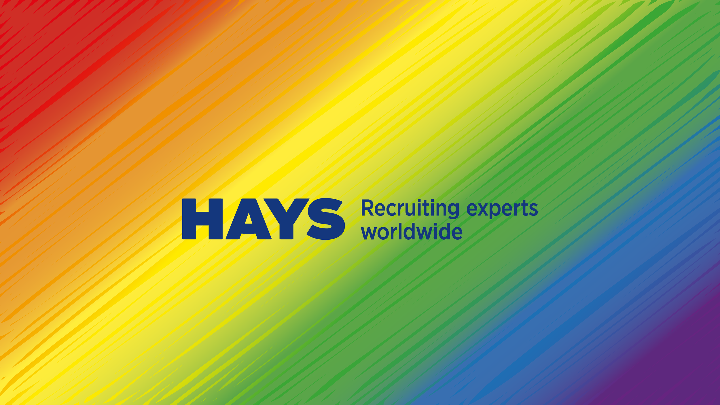
Embarking on a mission as vibrant as a confetti cannon, we were handed the task of creating a one-of-a-kind identifier for Hays' global Pride initiative—an internal beacon of joy. In a world with only 8 'H' symbols across their entire global business, this project lit up like a disco ball for Hays. Drawing inspiration from the Pride rainbow, we playfully splashed the identifier with a spirited scribble style, embodying freedom while ensuring it's as unmistakable as a unicorn in a field of horses. The accompanying guide not only laid down the law for usage but also flaunted its dynamic look across various touchpoints. Together, we injected a riot of color and meaning into Hays' commitment to inclusivity and diversity, turning their workplace into a global party!


