THE GREAT BRAND COVER-UP
We’ve all seen them. The high-gloss logo reveal. The LinkedIn posts clinking metaphorical champagne. The agency case study that swears it’s “not just a rebrand, it’s a revolution!”
And then… nothing.
The brand carries on exactly as before. Same confusion. Same audience indifference. Same internal eye-rolls. The rebrand quietly dies somewhere in a forgotten SharePoint folder, mourned by no one, remembered only by the agency’s invoice.
Let’s be clear: the problem isn’t rebranding. It’s doing it without reason, without rigour, or without real change. A new font won’t fix a fuzzy proposition. A colour refresh won’t inspire your team. And a shiny logo won’t matter if you’re still talking to the wrong people, in the wrong way, for the wrong reasons.
When rebrands go rogue (and do absolutely nothing)
Here’s the thing, many brands don’t need a rebrand. They need a rethink. Or at the very least, a refocus.
So who were among the rebrands that didn’t stick?
Some were loud. Some were expensive. Some were… just beige. These are the headline-grabbing rebrands that promised transformation but barely moved the dial. (Don’t worry – we’re not dragging Jaguar into this. That horse has bolted.)
Tropicana (2009)
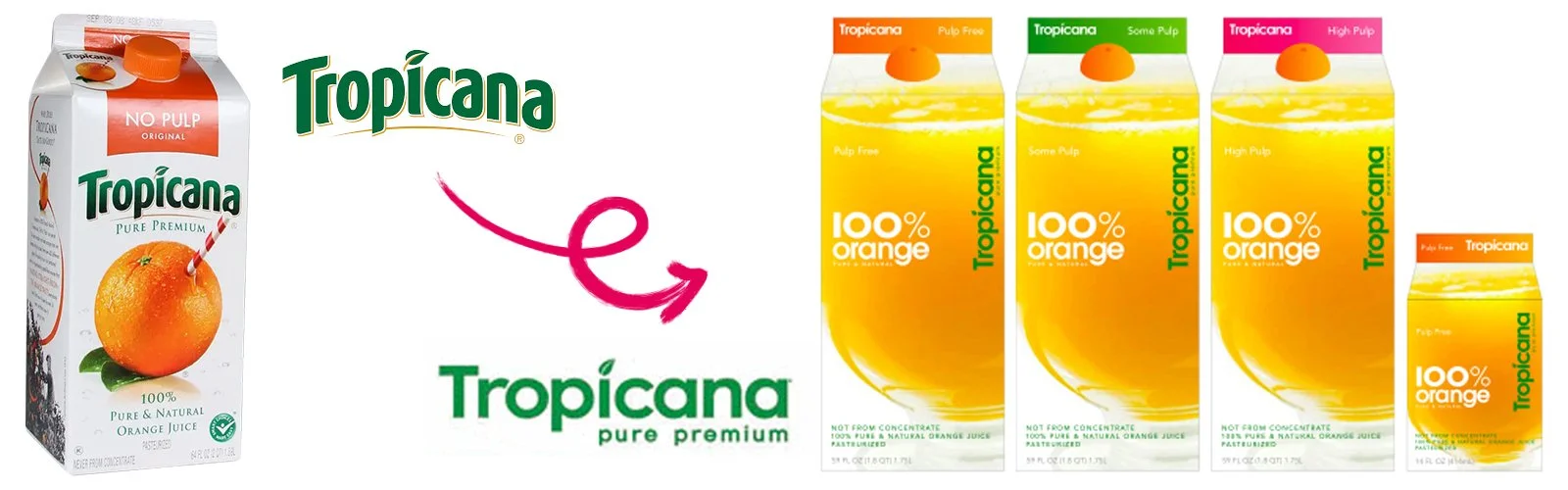
A now-infamous case: PepsiCo spent $35 million on a rebrand that stripped away Tropicana’s familiar visual cues, and sales dropped 20% in less than two months. They reverted back within 30 days.
Why it failed: It made loyal customers do a double-take… and then walk away.
Lesson: Don’t ditch brand recognition in the pursuit of looking “modern.”
Yahoo (2019)

What changed: New lowercase logo, purple palette refresh, and a new app interface.
Why it didn’t land: Despite clean design, it failed to address the brand’s deeper identity crisis. Visual updates alone couldn’t rescue audience relevance or cultural positioning.
While no public figures disclose the full budget, the rebrand was broadly criticised as cosmetic, adding little value to the brand’s overall decline and appearing disconnected from any strategic shift. Some estimates suggest the company was still bleeding hundreds of millions in ad revenue due to continuing user apathy.
Lesson: A polished logo won’t fix a lack of substance, especially when the audience has long moved on.
Gillette (2019 “The Best Men Can Be”)

What changed: A bold repositioning over a rebranding that called out toxic masculinity, building on the brand’s classic “Best a Man Can Get” heritage.
Why it divided opinion: The shift felt too sudden and disconnected from Gillette’s long-standing identity, alienating core users. According to financial reports, its grooming division saw a 5%–8% drop in revenue in the campaign period, part of an $8 billion write-down in brand valuation.
Lesson: Don’t chase purpose without earning it. Evolution needs continuity.
Gap (2010 Logo Rebrand)

What changed: Replaced the classic blue box logo with a minimalist Helvetica version and a small blue gradient square.
Why it failed: The new look was unveiled without warning, lacked connection to Gap’s heritage, and sparked instant backlash. It was pulled within six days after widespread criticism.
What it cost: Estimates suggest the botched rebrand and reversal cost Gap around $100 million when factoring in design, rollout, and brand damage.
Lesson: If your rebrand looks like it came from clip art and ignores emotional equity, your customers will remind you who really owns the brand.
When Rebrands Actually Work
Of course, not all rebrands flop. Done right, they become iconic turning points. Airbnb’s 2014 rebrand introduced the “Bélo” symbol - not just a logo, but a new visual language for belonging. McDonald’s shifted its brand narrative with subtle design and tone changes that aligned with health-conscious trends, without losing its mass appeal. Burger King’s 2021 retro-inspired rebrand fused nostalgia with modern aesthetics and bold colour systems, increasing brand relevance and ad effectiveness. And Monzo, a UK fintech darling, has stayed visually consistent while evolving its brand tone and messaging to match user behaviours and scale.
These brands had one thing in common: they didn’t start with a new logo. They started with a clear strategy, a real sense of purpose, and a deep understanding of how they wanted to be experienced.
The tell-tale signs your rebrand won’t work
If you’re doing any of these, put the Figma file down and step away from the mood board:
You’re updating the logo… but not the strategy.
You’re redesigning the packaging… but not fixing product relevance.
You’re “going digital”… but haven’t defined a digital proposition.
You want to “target Gen Z”… but don’t know what they actually care about.
So what should you do instead?
You don’t always need a prettier version of the same brand. You need:
1. A clear, defendable brand positioning
One that knows who it’s for, what it stands against, and why it exists.
2. A core idea that informs everything
Great brands are built around one compelling thought that can flex - not just a strapline or a manifesto.
3. A visual and verbal identity that serves a purpose
Design is strategy made visible. If your new look doesn’t help you show up sharper or sell more convincingly - it’s art, not branding.
4. An internal culture to back it up
Your people need to feel it and live it - otherwise, it’s just a PowerPoint.
Our favourite kind of makeover? The ones that matter.
We’re not anti-rebrand, far from it. We just think they should do something.
They should:
Fix a broken reputation.
Refocus a business with shifting priorities.
Launch something bolder into a new market.
Or reignite a team around a powerful shared idea.
And when they do? They don’t just change perception. They change performance.
Because good design is noticed. But good strategy is remembered.
The checklist: Do you really need a rebrand?
Has your audience changed significantly in the past 3 years?
Do your internal teams struggle to articulate what you stand for?
Are you losing relevance or distinctiveness in your category?
Are your competitors telling a better story than you?
If you answered yes to more than two - you may not need a rebrand. You need a rethink!
One last thing
If you’re thinking of refreshing your brand, ask yourself: will this change perception, or just decoration?
And if you want to do the former, let’s talk. We’ll make sure your rebrand doesn’t die in SharePoint.
Want to talk brand strategy that actually delivers? Let’s make some mischief!
Sources: AdAge, “Tropicana Discovers Some Buyers Are Passionate About Packaging”. CNBC, “Gillette’s ‘We Believe’ ad sparked debate, and it also boosted sales”. The Guardian, “Gillette’s #MeToo ad on ‘toxic masculinity’ gets praise – and abuse”. Fast Company, “Why Yahoo’s New Logo Didn’t Work”. BBC News, “Gap drops new logo after online outcry”. Wired, “Airbnb’s new logo is a symbol of ‘belonging’”. The Verge, “Burger King’s first complete rebrand in over 20 years is retro”. The Verge, “Burger King’s first complete rebrand in over 20 years is retro”. It’s Nice That – “Monzo unveils evolved identity to show ‘we’ve grown up’”. Monzo Blog – “Monzo’s new look and feel”.